20 Best Tips

Grab my Button {Code Box on Right} Tutorial

Several of you have emailed me wanting to know how I made the ‘grab my button’ code in my sidebar horizontal, instead of the typical coding underneath the image. I changed mine around using a table format to free up a little bit of space in my sidebar. The one that looks like this:
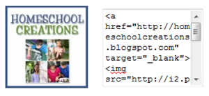
imageReady for me to share some html coding with you so you can make your own?  You’ll have to add in your own links and html, but here are the instructions. 

I added this as an html gadget from my Blogger dashboard {if you have another blogging platform, I’m sure you know how to add an html gadget, right?}. Be sure that your sidebars are wide enough before you try to install it ~ my button is 125×125 and the text box adds at least another 150 pixels. In general, my sidebars are 300 pixels wide, so if yours are only 150, this will not work right!

Click on this lovely little box and then click the ‘html/java script’ button that pops up:

image

Copy and paste the code below and drop it into that html box. Before you hit save, you’ll need to do the following to the code below:

1. Replace the blue parts of the code below with the http link to your image {if you use photobucket you will be using the ‘direct link’ coding.

2. Replace the pink parts of the code below with your blog/website address.

3. Replace the purple parts of the code with your blog/website name. For example, I would use Homeschool Creations {make sure you keep the quotation marks in the coding}.

Try it out!! Grab the code, replace the highlighted coding and try it out on your blog! Let me know how it works for you. :)


<table width="100%"> <tr> <td align="center"> <img src="http://imagelinkhere.com" alt="Your Blog Title Here" /> </td> <td align="center"> <textarea rows="6" cols="15"> <a href="http://yourblognamehere.com/" target="_blank"><img src="http://yourimagelinkhere.com" alt="Your Blog Title Here" /></a> </textarea> </td> </tr> </table>


Note: I changed the % width on mine to 90% to make it a little bit smaller.

Don’t forget to join Homeschool Creations on Facebook too!

Sharing is Caring Widget

You may have all noticed the little widget that I have at the bottom of my posts. Several of you all have emailed and asked how I put it there ~ and others of you might wonder what in the world it’s there for. I like it because it pops-up, but that’s just me}. This is the one that I’m talking about:

Sharing is caring social bookmarkWhy use social bookmarking tools?

Social bookmarks are a great way to organize and search through various web resources ~ basically just sharing great references that you find. You can keep your bookmarks private or share them with others.

~ quick way to share links with others via Facebook, Twitter, email and morewhen you find something that you really like

~ great way to save information for future use {I store things I find for later in our studies}

~ can email yourself or others a great link that you find ~ I do this with recipes or fun game ideas

Want to add the sharing widget to your own blog? I opted for the ‘Sharing is caring!’ logo rather than the original ‘Sharing is se*xy ~ just didn’t seem to fit the overall theme of my blog, you know?  Here are two great tutorials that will show you:

Sharing Social Bookmark Tool ~ this is the main tutorial that even includes blinking text to show you where you need to insert your own links {facebook, twitter, email, etc…}.

Sharing logo ~ this post provides the image code to use to replace the image with the ‘Sharing is Caring!’ image

You can also choose to delete the ‘sharing’ image and just have the buttons all by their little lonesome. Find the following code in your html {once you have the above coding installed} and change it as below.

background:url(‘http://i43.tinypic.com/2ueii3t.png‘) no-repeat left bottom;
position:relative;

Replace the line in red above with the following line:

background:url(;) no-repeat left

Note: Several of you have asked too about my widget being shorter than the one in the tutorial. I deleted several of the ‘pop-up’ buttons. For example, in the first part of the tutorial {the long coding section}, I deleted the sections that I didn’t want buttons for {reddit, yahoo, etc…}.

If you’d like the html coding that I used for the second section, please leave a comment with your email address and I can send it to you. I removed it because of some of the emails I was receiving ~ not exactly ones I’d like to get!

That’s it! Have fun installing it!

Removing the “Showing posts with…” Label

I’m not super fond of that little box that shows up at the top of searches that I do for specific topics on my own blog. Pretty much unnecessary for the most part.

This is the one that I’m talking about:image

Want to know a quick and easy way to remove it?

1. BACK UP YOUR TEMPLATE. I know it seems easy, but trust me ~ you just never know!

2. In your Blogger account, go to DASHBOARD ~ LAYOUT ~ EDIT HTML  and be sure to click the little box that says ‘expand widgets’.

image 3. Find the following block of coding in your html {you can copy the first line and use the CTRL + F keys to find the line}:

<b:includable id=’status-message’>
<b:if cond=’data:navMessage’>
<div class=’status-msg-wrap’>
<div class=’status-msg-body’>
<data:navMessage/>
</div>
<div class=’status-msg-border’>
<div class=’status-msg-bg’>
<div class=’status-msg-hidden’><data:navMessage/></div>
</div>
</div>
</div>
<div style=’clear: both;’/>
</b:if>
</b:includable>

4. Replace the above coding with the following block of coding:

<b:includable id=’status-message’>
<b:if cond=’data:navMessage’>
<div>
</div>
<div style=’clear: both;’/>
</b:if>
</b:includable>

5. Save your template and the box will be gone!

I Can’t Answer You!!

Some of you have been asking me some questions in your comments and as much as I would love to reply ~ I can’t!!

Many of you do not have an email address linked to your comment, so there is no way for me to reply personally to you. The return email address for your comment reads “noreply-comment”.

You can QUICKLY fix this by clicking just one little box. Go to your user profile and check the box where it says ‘show my email address’. No one else will be able to see your email ~ except the person you are leaving a comment to.


I promise it’s safe – do you have your little box checked? I’ll know if you comment! :)

You Asked! ::2::

I answered a few of your questions a few weeks ago and after that had another round of questions that were asked about various things. If your email address is linked to your comment, I do try to reply to you ~ but sometimes the questions are asked by several people so I’ll occasionally answer questions in post form too so everyone can see the answers.

Today’s questions are focusing on blogging tips ~ just a few though. Quite a few of you asked about making your own blog buttons and I’ll have to go through that step-by-step another time {or point you in the direction of another great post about it!}.

Q: How do you change your blog layout or template without messing everything up? I hate using the standard blogger template but I am afraid to mess something up and lose all my work!

A: I have a ‘test blog’ – it’s hidden so nobody can see the mess that it is. My test blog was created so I could freely play around with the html or template and not worry about wreaking blog havoc. On my test blog, I try out new buttons, headers, or layouts BEFORE I actually make the switch on either of my blogs ~ and it has saved me from a lot of trouble. :) Since you can create free blogs with Blogger – it wasn’t a big deal to create it. Once I know it is safe, I can easily cut/paste the html and update my actual blog without worry.

And always be sure to back up your template before making any changes. Always. I have a Word document saved in my files with the current html for both of my blogs. Just in case. And we won’t even talk about the fact that I messed up my blog because I didn’t follow my own instructions once. Nope, we won’t.

Q: How do I add those “you might like…” boxes?

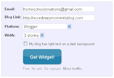
A: This is so very easy. Visit the Link Within website and they will literally walk you through the process. You enter your email, blog address, and what blogging platform you use and click “get widget”.

You can either use the code they provide and add your own widget following their directions, or you can let them do it for you. It’s that easy!

Q: How did you get your blog to three columns?

A: Really, the answer isn’t something you are going to like. How I did it ~ and how I’ll recommend you do it are two completely different things. I have a bad habit of fiddling with my html. Very bad. Especially since I just play and learn and to stop and tell you what I did or how I did it….I’m not always entirely sure.

Here are a few places I would recommend that you check for free templates of 3 column blog templates:

There are a few places to get you going – but you will have to install the code yourself. :) Have fun looking!

Photobucket

Centering Blog Sidebar Buttons

You know those cute little buttons over in people’s sidebars? You know how when you put one in your sidebar sometimes it might be centered in the sidebar….or all the way over to the left of the column….and then they end up all funky looking? Or maybe you put them on your sidebar and they all clump together with no spaces between them?

Does it drive you nuts? Well, it drives me nuts and I get a little, ummmm…particular about having things ‘just so’. ‘Cause I’m just picky like that.

If you want to center those buttons in your sidebar, be sure to add the following html code when you copy/paste their button code:

Place this before the code: <center>

And place this after: </center>

If you would like to add some spaces between your blog buttons here’s a quick and easy way. Between the two codes at the following: <p></p>

Quick and simple….now go fix your sidebars!

Photobucket