- Like
- Digg
- Del
- Tumblr
- VKontakte
- Buffer
- Love This
- Odnoklassniki
- Meneame
- Blogger
- Amazon
- Yahoo Mail
- Gmail
- AOL
- Newsvine
- HackerNews
- Evernote
- MySpace
- Mail.ru
- Viadeo
- Line
- Comments
- Yummly
- SMS
- Viber
- Telegram
- Subscribe
- Skype
- Facebook Messenger
- Kakao
- LiveJournal
- Yammer
- Edgar
- Fintel
- Mix
- Instapaper
- Copy Link
Last week I received the following email from a reader and thought it would be a great question to address on my blog ~ just in case one of YOU had the same question.
I was looking through the Transportation pack and was wondering if you could consider picking a different font on the materials that the children actually use? Specifically I’m talking about the letter “a” … I would prefer the “a” version as that’s how they are taught to write it.
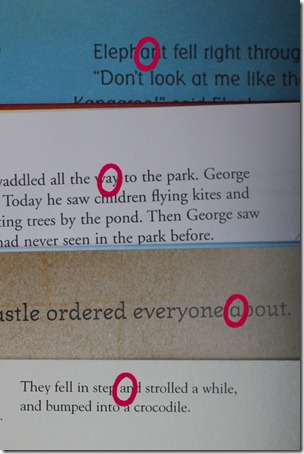
Specifically, here are the two different letter ‘a’ styles that are being referenced:
Here are my thoughts…
I realize that I use different fonts in my packs ~ sometimes because I really like a particular font, but also because I think that it is important to expose our children to different letter/font styles. We live in a media rich society and everywhere we look {tv, books, computer, billboards, etc…}, different font styles are represented. While I teach our children to write using the standard ‘teacher’ font style, there are numerous styles of letters and numbers represented in the books that we read every day to our children. My goal is to let my child SEE those differences, know that they represent the same letter, and let them be familiar with them.
For example, I took a picture of four books that I picked off the top of our book basket {Curious George, Tumble Bumble, In the Castle and one more…}. If you look at the letter/font styles, two of the letter a’s are shown in the style that most children learn to write their letters in and two are in the other ‘a’ style.
The bulk of the Preschool Packs that I’ve put together were primarily created for me to use with my children during our school time. Because we’ve enjoyed them, I’ve then shared them with you. While there have been times that I’ve added an activity or switched something around, typically I try to do things the way we enjoy using them so there isn’t a lot of extra work involved on my end of things.
Hopefully that answers your questions! :)


 The printables shared on this site are FREE of charge unless otherwise noted, and you are welcome to download them for your personal and/or classroom use only. However, free or purchased printables are NOT to be reproduced, hosted, sold, shared, or stored on any other website or electronic retrieval system (such as Scribd or Google docs). My printables are copyright protected and I appreciate your help in keeping them that way.
If you download and use some of my printables and then blog about them, please provide a link back to my blog and let me know - I'd love to see how you are using them! Please be sure to link to the blog post or web page and not directly to the file itself. Thank you!
AND Thank you for sharing all your hard work with us! :-)
Great answer, Jolanthe! I agree that it’s important to expose your kids to various font styles. I myself write using the non-traditional “a”, while I teach my kids the other way. LOL
Thank you so much for sharing the FREE downloads! We love them! I also agree that it is important to have developing readers and pre-readers see many different styles of font. It is an easy discussion, and can be really fun! I have my girls look for the “fancy a” or the “fancy g” (look at the little g in George from the books). I find the most easily confused letter is the capital I that looks like the lowercase l. Like in this font! But, I just point out that the capital I forgot his hat and shoes today, and the girls go happily on with their work!
Thank you so much for sharing with us! I agree that our children need to be exposed to the different fonts.
@meclarks: I love the way you explained the “I” forgot his hat & shoes. :)
I’m always amused when someone starts trying to ask for more specific things in free stuff (and I know I’ve done it too), to some extent with the advent of blogging and all the people giving stuff away we are so spoiled. It’s amazing how spoiled we are by what we can find for free online.
You make awesome packs, thank you for making them :)
I wonder if the person who asked this uses “100 Easy Lessons.” That’s what we use, and they introduce the short a sound written “a” – the actual typed one! My kids have used various handwriting materials (you know, the artsy one loves Draw, Write, Now), so I just explain it to them or alter it, and we go on. LOVE your sites and appreciate all your sharing! Thanks and blessings!
Wow, I ran into that problem when making a ABC book for my grandson. Personally I use both ‘a’s depending on what I’m doing. Have you looked at the G. So many things use the old fashioned g. and my grandson’s name starts with G. So… I will show the alternatives but as far as teaching, (educator, mom, grandmother – that I am) I would go with the common forms.
Again, it gets into the fact that you can pick up books and find a
variety of fonts in just the books. If we’re not exposing our kids to
the different fonts, then it’s not helping them any in that sense
either. Whenever I add in writing/handwriting portions, I always use the
common teacher font, but still think that it’s important to show a
variety of fonts. :)
I’m glad to see this brought up because I’ve never noticed or thought about it for “a” and “g”!
I have issues with upper and lowercase “u”. I write them with a tail but my 10 y/o son doesn’t. I am not sure of the correct style for those. (Online searching just now shows no tail for uppercase, and a tail for lowercase.)
The “missing hat and shoes” for “I” is clever, the kids will like that. My 6 y/o daughter has trouble with that one thinking it’s a lowercase “L”.
And yes, thank you Jolanthe for the freebies. I appreciate them as well. :)
I also think it makes things more fun to see different fonts!
Your freebies are awesome!
If it might help anyone – when I taught kindergarten (and now with my own) we just always took a few minutes to show and explain the difference between “book letters” for a and g and then the version we write. Then the students never seem to have trouble with it. You can also have them do a hunt or search for different versions (in their books, posters around the room, at the library, etc). It also makes it easier then when Grandma or someone else sends a note and write a letter differently from them. If the are used to different letters they don’t get quite upset. :-)
I ran in to this when I assigned my struggling letter learner the task of carrying one flash card around for a week looking for letters that matched. The A card was such a challenge that we didn’t do any letters beyond that. He could find capital A’s all over, but because the a on the card was the style most of us write, and the one in printed materials wasn’t, he got discouraged not being able to find the match.
I agree that they need to learn both, just thought I’d share what happened with us. As for asking for customization-not knowing what program is used to create the packs, I might have asked too. In many programs it’s a simple case of highlighting all the text and clicking a few buttons to change the font, so from a user’s perspective it could be seen as a very simple request that could be done or not, no harm in asking. Now, haing said all that, I AM grateful for all of these free resources and had I made a request would have been sure to pass along my appreciation for doing the hard work. So thanks for sharing your resources with us!
The only problem with that is that I would have to change all of the
text font in the pack…not just one letter for the bulk of it. So that
does involve more work for me because I would have to change much of the
pack that I am creating typically for us to use and want to make it more
visually appealing as well. The words are all typically in separate text
boxes, so it’s not just a simple solution usually. :) When you also add
in the fact that different texts need to be different sizes, etc… to
fit into a certain area, it becomes much more labor intensive to make
sure it all fits right.
That’s why I said it depended on the program. I figured it wasn’t a simple word processing doc that would be easy, but not knowing, I might still have asked. Different text boxes etc would definately be too much work.
I know!! But figured if someone else is reading it would answer the
question. :)
I want to chime in as well. I create similar homeschool printables for my son and I too vary the fonts.
I taught kindergarten for 6 years, and in our assessments it was a REQUIREMENT that our children have letter recognition in varying fonts. So much so that I had to create a letter recognition assessment with “q”, “g”, and “a” in varying fonts. For my class, I would call lowercase a, “A with a baseball hat”
You are absolutely correct, it is essential that a pre reader recognize varying fonts and text!!
These printables are a LOT for work!! I create mine and share with my friends. If I were just to do them for myself it wouldn’t take that much time. But the process of saving to pdf and uploading and then explaining each activity (which I do) is time consuming. I am thankful for people who share there’s and would never ask to modify someone else’s!!
i agree with you…if we only teach one font they will not be able to read the letter in a different font…that said my little one is just learning so I am trying to teach him the traditional now(trying to keep it simple) but when he knows his alphabet and begins writing I will introduce the other fonts.
In my experience, exposing children to different types of print is only beneficial. The different “a” never phased my son as he was learning to read.
Which font do you use in your preschool memory verses? It provides perfect definition to each letter!
Love Ya Like a Sister is my favorite font for that age group. :)